Smokeball
Problem
To support a major US growth initiative, Smokeball needed to reposition its web experience in a crowded freemium market. Research showed the product felt overwhelming—particularly for solo and small firms—and lacked the simplicity, clarity, and visual appeal needed to drive adoption.
Approach
With tight timelines, I partnered closely with the Brand and Marketing team and prioritised a focused UI refresh, improving navigation, layout, typography, colour, and visual hierarchy. In parallel, we used this work to establish Smokeball’s first design system, creating shared components and patterns to support both immediate delivery and future scalability.
My Role
Owned | Led | Contributed to |
|---|---|---|
End-to-end visual and UI design direction, including navigation, layout, typography, colour, and visual hierarchy, as well as the establishment of foundational design system elements. | Hands-on design execution of key screens and patterns, while aligning Product, Engineering, and Marketing on scope, priorities, and delivery within tight timelines. | Design system foundations, front-end implementation approach, and evolving standards for a more consistent and scalable product experience. |
Outcome
The refreshed experience improved first impressions and reduced perceived complexity for new users, supporting acquisition efforts in a competitive freemium market. Internally, the introduction of a design system created a shared visual and interaction language—improving consistency, reducing design and engineering friction, and enabling faster, more scalable product delivery.
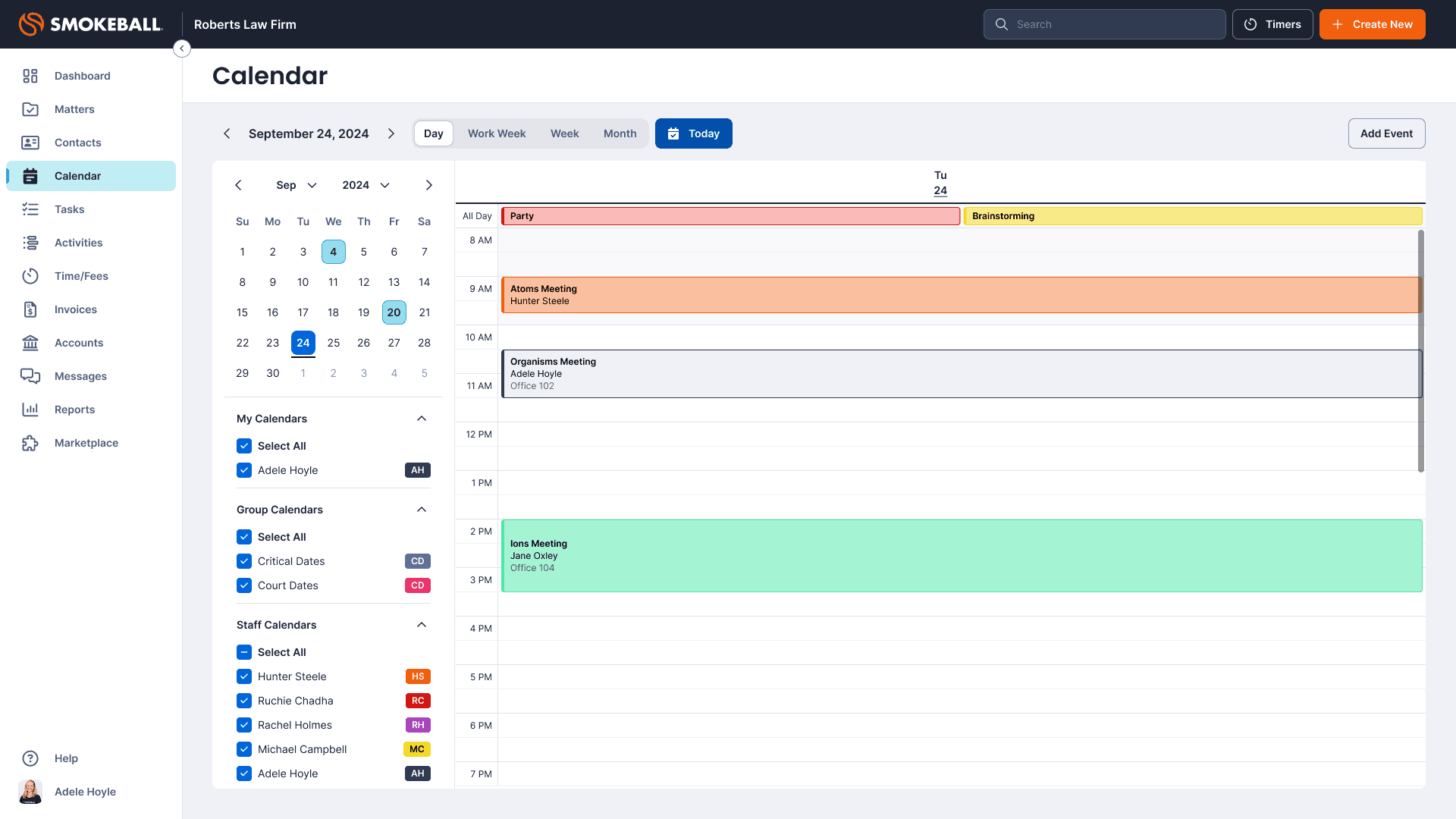
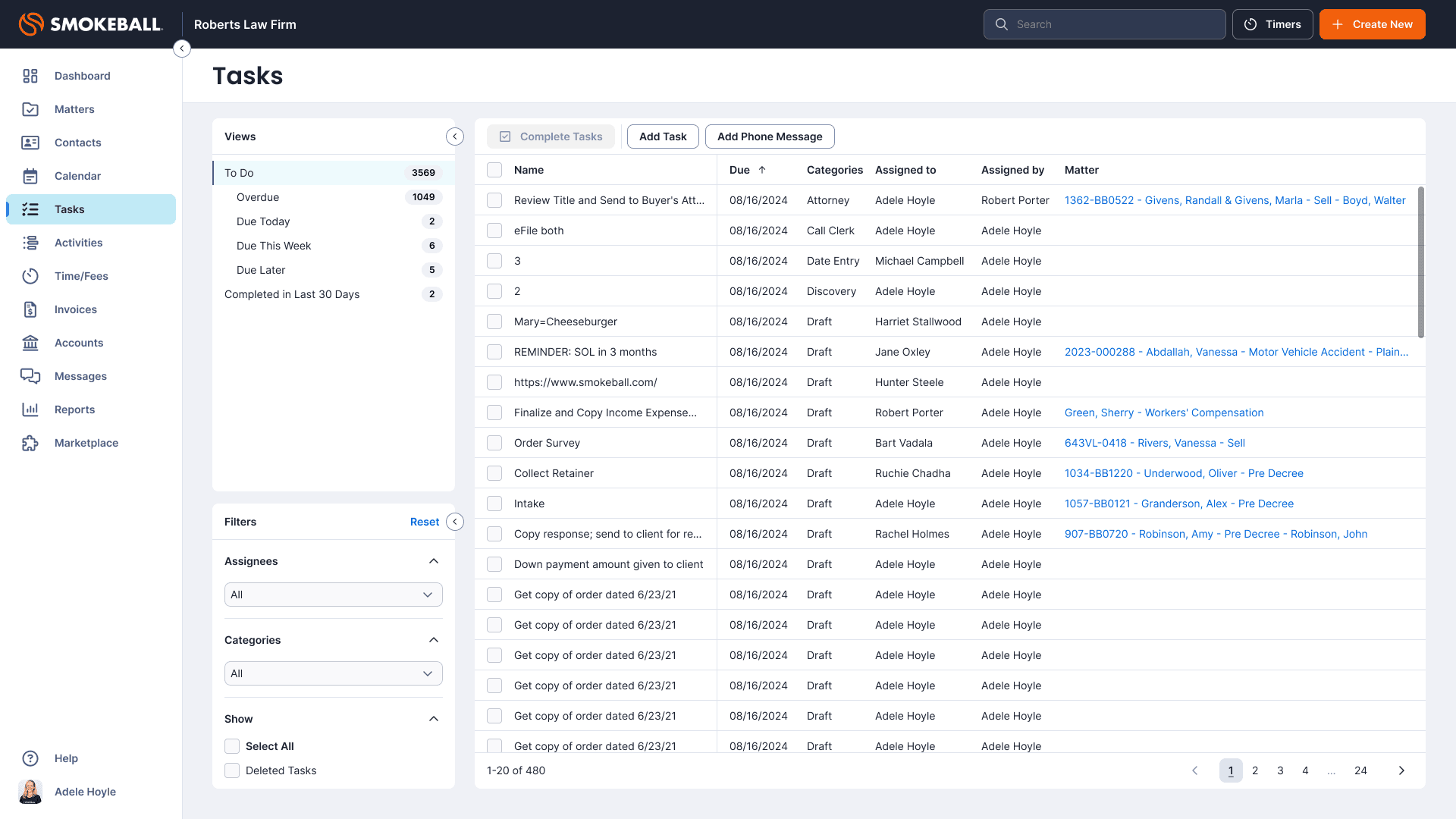
Before UI Refresh
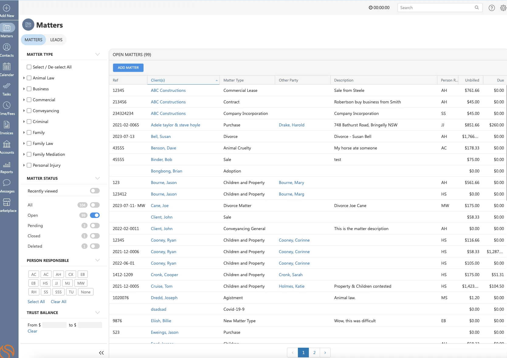
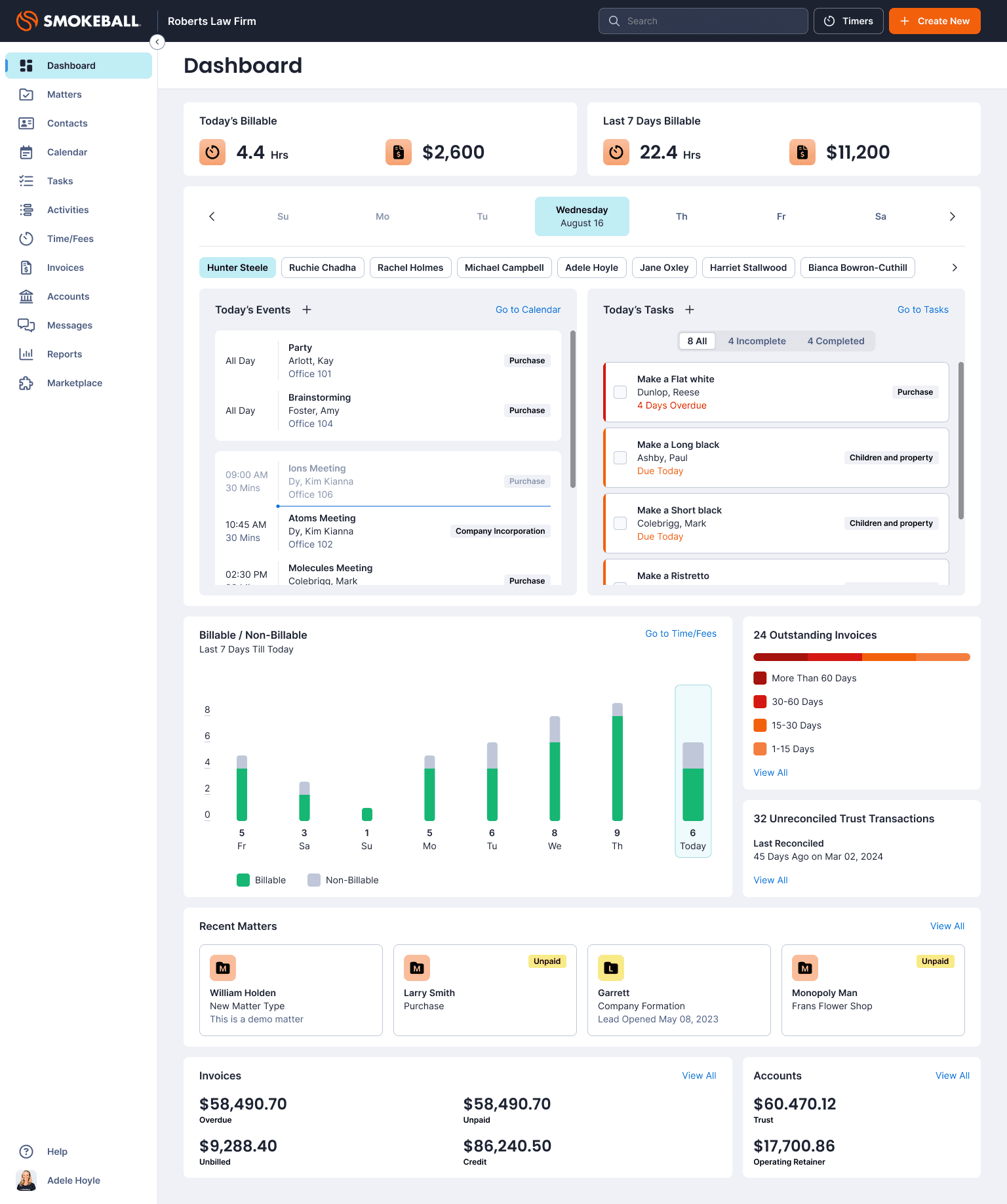
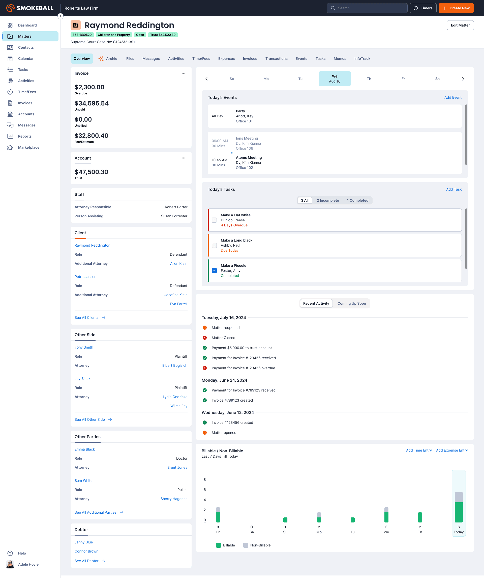
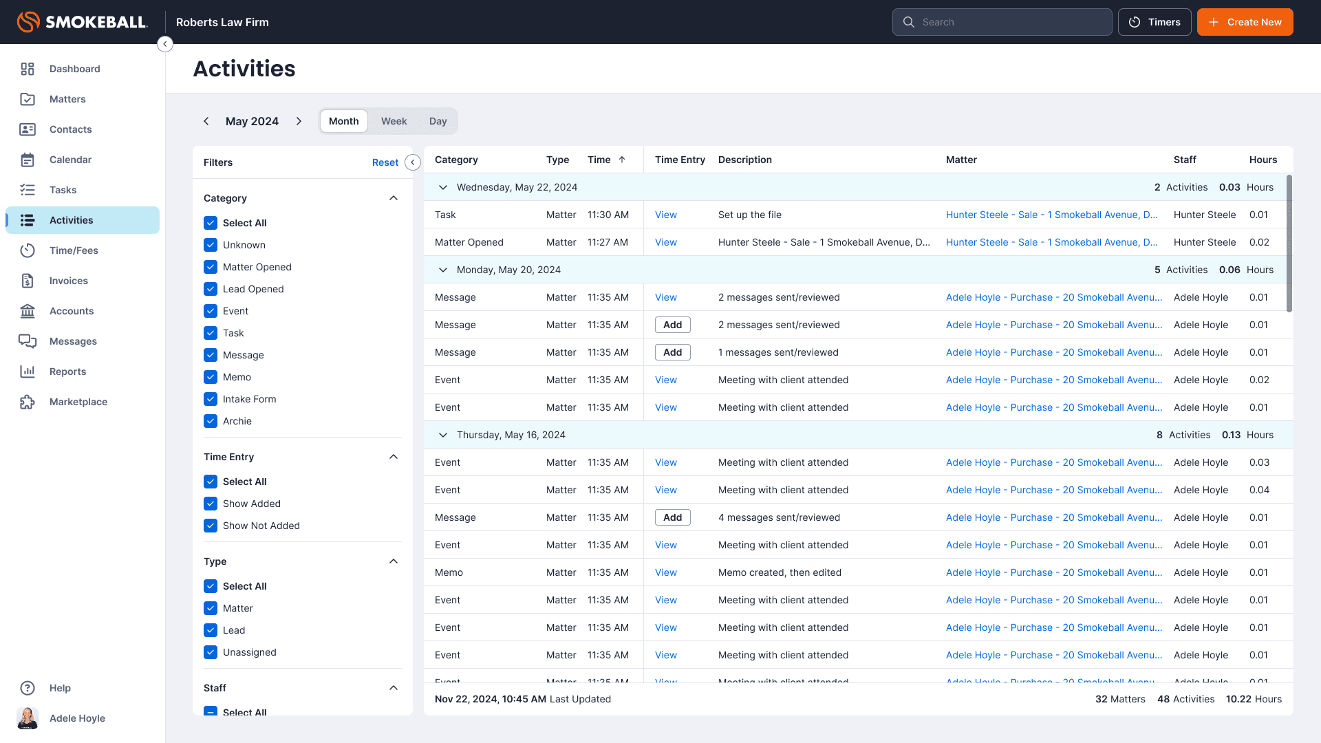
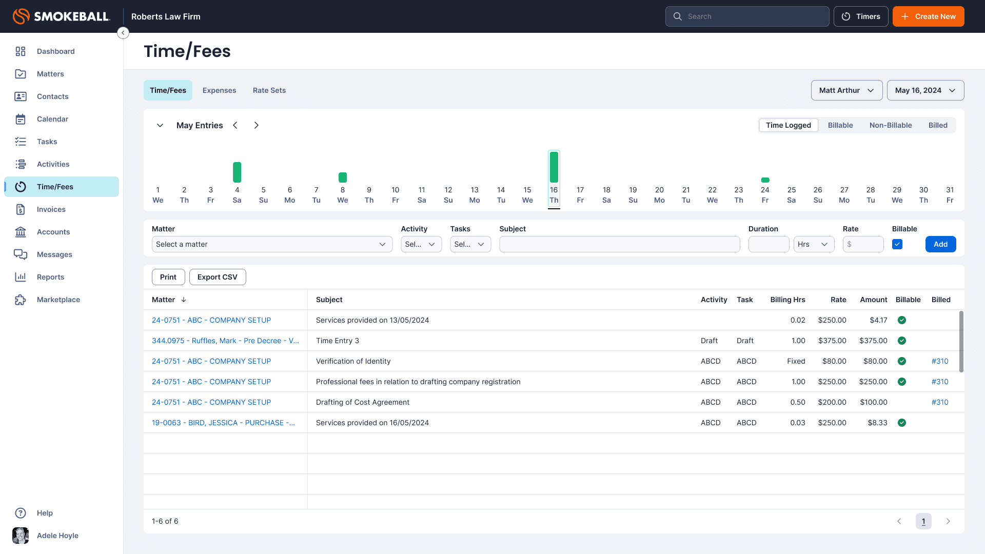
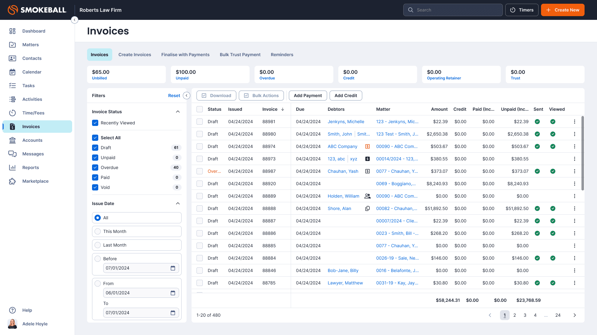
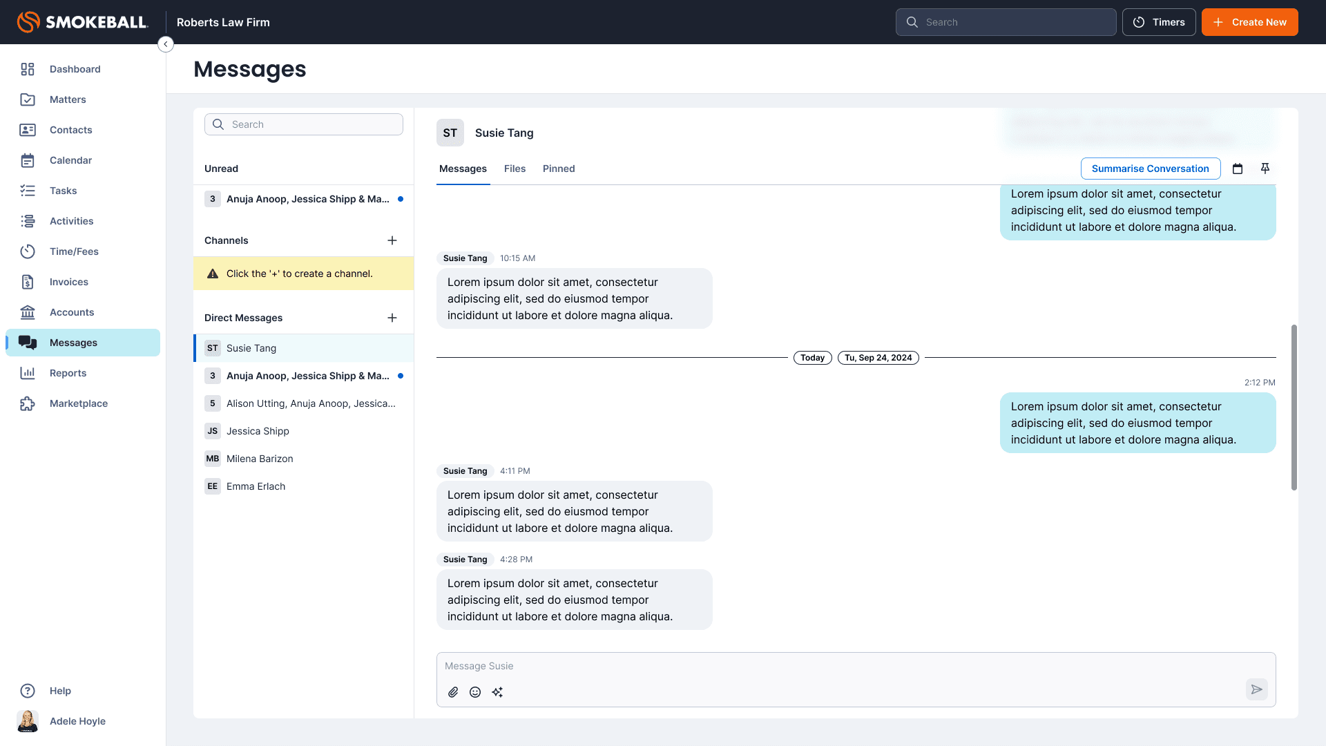
After UI Refresh